Wednesday, 26 January 2011

Trailer Comparisons- Slasher

http://www.youtube.com/watch?v=ayvHRgYNvzU

http://www.youtube.com/watch?v=O76m3kpgPTQ


I've looked at the trailers for 'The Hills Have Eyes' and 'Prom Night'. Both of which seem to have a similar format:


  • The trailers both start off quite light hearted, there is lively music at the start, in 'Prom Night' its rock music, which is sterotypical for American students to listen to at that age, and in 'The Hills Have Eyes' the music at the beginning sounds more 60's like.

  • They both have high key lighting at the beginning, which connotes that nothing bad is going to happen, but suddenly around half way through the trailer the mood totally changes.

  • When the mood changes, so does the music and the tempo of the trailer. The music changes to a darker more intensive sort of sound. In 'Prom Night' the sound effect of a heart beat is used, which also is used in 'The Hills Have Eyes'.
  • There are quick cuts used to speed up the tempo of the trailer, this makes it more dramatic for the audience and makes it look more exciting. This change goes well with the change in music, and they work together to create suspense and tension.
  • To go with the changing of the mood, the high key lighting changes to low key lighting. This is especially the case in 'The Hills Have Eyes'. The further along the trailer you go, the darker it gets. This, along with the convergence of the quick cuts and the change in music, makes the trailer go from a light hearted beginning, to a colder, darker ending.

SAW Franchise - Inspiration

Saw was a film in which inspired us for our poster ideas, we wanted the main focus to be on the image, as sometimes the text on some posters can be too predominant and take away the main focus and that being the image.
Here are some examples of Saw posters where there is not much text and the overall focus is the image.


The images are really gritty. Lots of questions arise as to how these people have got themselves into the situations. The saturation of the film is also to a grey scale, which is not usual for posters as they normally have a red theme to tie in with the blood used in the movie.
I think this is important as the focus is the image, although SAW is part of a franchise so people can see one of the images and automatically relate it to the previous films. Although we are not part of a franchise, it gives the film a mysterious look and people will want to see it.
Films like ‘Drag Me to Hell’ have the director on the poster to show that it must be a good film to see as they have a good director. Sam Raimi is featured on the poster for ‘Drag me to Hell’, as he is a well respected director and has made films such as ‘Spiderman’. This was not important for Dark Room Productions as the poster alone would attract many young horror fans to want to see it.
Some other posters which also have the same use of using a little texts is ‘Trick r Treat’ , ‘The last Exorcism’ and ‘The eye’. All these posters have a lot of copy space but this has not been used. I think these posters are more affective as they focus more on the image and less on the actual text. When looking at a film poster, the majority of people are drawn to the image and focus on the image used and what is happening. The credits used are not normally looked at and observed, where people have a more pictorial way of thinking they will remember the image and not what the actual text says.
One poster ‘Wolfman’ is extremely effective as it only has the title on the poster. It doesn’t have the date or any credits. This is effectual as the image stands out and it is very memorable, people rely more on the internet now to tell them when the film comes out and they would have to go on the internet to check out the times of the film anyway, so the use of using a very strong image and just the title is something which we have decided to follow too.

Here is another example of the image being really effective and making the audience think about what will happen in the film. in this poster ‘Ruins’ the image is off a group of teenagers in a group, and alike the conventions of most films, the group of teenagers die one by one.

‘Prom Night’ also has the ‘stereotypical’ convention of again a group of teenagers and they die. Although film goers can easily guess the plot, with not much text being on the poster it leaves more to the imagination.

Research - Film posters

DRAG ME TO HELL
MY BLOODY VALENTINE
·         Some of the text on the poster is white and the credits are in orange to tie in with the flames and the burning connotation.
·         The victim on in the image is blonde which is a convention that many horror movies follow. The convention of using a blonde woman as the main victim connotes that she is stupid and ‘dumb’.
·         In most horror movies the blonde female has a nice life and a nice job which ties in with the text. ‘Christine has a good job…boyfriend’ the white text may tie in with the purity and that everything is perfect. The fact that she has hands around her coming from the fire is a direct link to the films name ‘Drag me to hell’.
·         Drag Me to Hell, is a paranormal film, which is why it has satanic references in the title and also with the hands coming from the ‘depths of hell’
·         MBV has a red title, which links in with the blood and the lexis ‘valentine’ which means it could be about valentines day, however, as it is clearly a horror film because of the axe being used, it is a juxtaposition, as it has nothing much to do with the normal connotations of valentines day.
·         The poster is very mysterious as you cannot see the people’s faces, as they are covered up with gas masks.
·         My Bloody Valentine is classed as a slasher horror, you can see this as not only is the film in 3D with an axe coming outward, you can tell by the red theme and also the red text.

Poster Comparison - Slasher Horror


Comparisons:


  • Most horror films have the title in the lower third of the poster, in this case, 'Prom Night' and 'A Nightmare on Elm Street' support this convention. However 'Asylum' and 'The Hills Have Eyes' don't. This maybe because they are trying to make the film stand out when marketing it, or that it may go better with the picture used in the poster, It certainly does in 'The Hills Have Eyes'. The composition goes really well.


  • All of the films have one main image which is also a convention in horror posters. 'A Nightmare on Elm Street' however uses more than one picture and fades them together to create an eery effect. This is the same with 'The Hills Have Eyes', at the top you can see what looks like to be some trees, or possibly a line of people, connoting the possible setting for the film.


  • 'Asylum' and 'Prom Night' are the only one out of the four posters I have chosen not to have the Steel Spring credits that you usually find on a poster. They are usually situated at the bottom of the poster in the centre. 'The Hills Have Eyes' doesn't follow this and puts the credits to the left at the bottom.
  • They all follow the conventions of the colour schemes associated with horror movies (blue, green and brown). 'Prom Night' has a blue theme, which is pretty obvious. 'A Nightmare on Elm Street' and 'The Hills Have Eyes' have a brown theme, although 'The Hills Have Eyes' supports a lighter, more bage look to it. And 'Asylum' has a subtle light green theme to the poster, this allows the blood that runs from the bold black title to stand out more effectively
  • Accept for 'Asylum' they all use low key photography. It makes films look darker and more gritty. This is a convention found in horror posters. However 'Asylum' opposes this with the use of the high key lighting. This may have been done for a number of reasons. It could be to reflect the feelings of the character in the poster, who looks pale, cold and distressed. It may possibly be down to nature of the film too. There is no right or wrong answer to how a film poster should be designed, they usually reflect the nature of the film.

Monday, 24 January 2011

Update No.15

Choosing the costume for our teaser trailer was not hard. As we wanted to use a cloak, we didn’t have to really think about the under garments for our female lead to wear. We did have difficulty thinking about how we should style the hair. We were in two minds about whether to create a chaotic hairstyle where you can clearly see that the person is mentally impaired for example ‘Medusa’. Or to have the hair in a demure fashion and this will create a mysterious side to the character.

Production - Make up


The make up used in our trailer is a form of art which is used all over the world in the film, theatre and music industry. It consists of various types of make-up, prosthetics, prostiche and also airbrushing, some of which we have used in our trailer. 

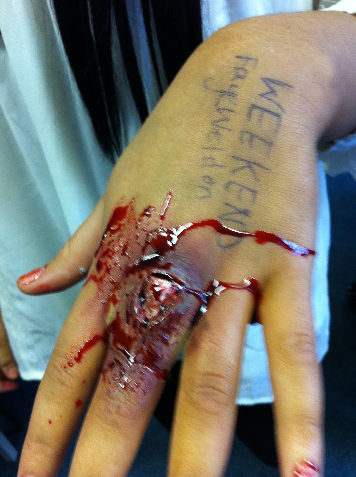
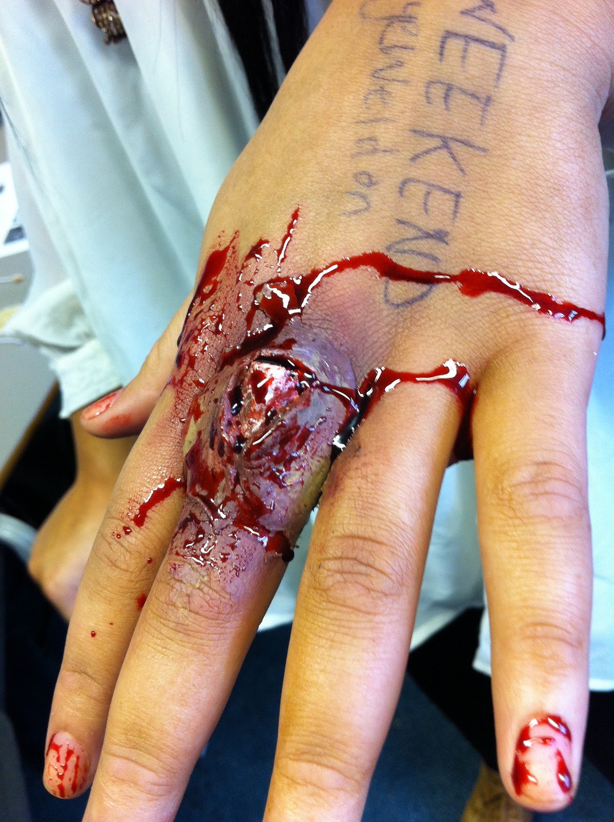
Casualty is a popular form of make-up as you can be imaginative and experiment with different media and techniques; it is often seen in TV, films and theatre. I found experimenting with the different types of cuts, abrasions enjoyable as we were able to create different dramatic effects, which are shown in the following images. 

When filming our trailer, we used latex to create the wound for the male actor. We had to build up the latex, so it would create a deeper wound, and have a more dramatic effect on the audience. I then had to lightly apply the red base colour, and then slowly built up the colour with shades of purple and green to make the cut seem authentic. To enhance the dramatic effect we wanted to create, I used liquid blood and applied it onto the model. 
we also used a technique, which consists of mixing sugar and water together, and we sprayed it onto the model, to give mimic the affects of sweating, We used this as it would have dramatic affect on the audience, to show that the male character is in a lot of danger, and that he is panicking.  

The make up we used for Satan’s mistress is very plain and simple; we used this affect as the killers in horror movies are normally the same type of character. We wanted to break the convention of our horror film, as the best way for someone to be scared by the movie or think about wanting to watch it, is if you make it seem realistic, so they would think that it could actually happen to them. This is why we didn’t use a lot of make up on our model as it would take away the affect we were trying to create. The low statistics of women being killers in horror films, made us want to use a female lead, the conventional make up of a female killer is that they are ‘demented’ and the appearance reflects this.

The ring
 The movies tell the tale of adopted child, Samara, an evil young girl who was pushed down a well and took seven days to die. The film focuses on a mysterious cursed videotape which contains a seemingly random series of disturbing, grainy, black and white images. After watching the tape, the viewer receives a phone call in which Samara condemns the viewer to death in exactly seven days.
The make up used on the girl in ‘The Ring’ is very chilling and the young girl looks very scary which creates a dramatic affect on the audience as although it is a young girl; who is seen as innocent and childlike. However, the make up used and the special affects make her scary.

Scream 2
One of them being Billy Loomis’s mother from the original classic, Mrs. Loomis, played by Laurie Metcalf, who wants revenge for the death of her son in the original. This was a brilliant parody of the horror sequel, by still sticking to the rules of the horror sequel.
Both these movies, the female is different to our leading female. In the ‘Ring’ the girl is young and has that ‘creepy’ young girl look, which is mysterious however it is not something, people would really believe could happen. It is the same with ‘Scream 2’ where the female killer is a mother looking for revenge. Nevertheless there are two killers, so she is not the leading female killer, which is why we have broken the conventions of this and used women as our leading killer.

This will have a great affect on the audience, as the conventions of women’s qualities and attributes does not reflect how Satan’s Mistress is. The stereotype of women are that they are, gentle, loving, caring; everything which this character is not. This is why it has an affect on the audience as the actress looks almost ‘normal’, which is the scariest thought for the audience as they believe it could happen to them.

The make up used on the boy being tortured is very dramatic, at first we wanted to use many cuts and bruises and a swollen face and make it seem like he has been beaten up. However we wanted to usher in a new trend in horror film making deemed "torture porn”. This tied in with the women killer as she is a sadist. This worked better as we didn’t have to use as many cuts on the actor, as it shows the pleasure the killer is getting out of it as the cuts are not very deep, however there are a lot of cuts on his body, which shows that the killer wants as much pain inflicted on the boy. If we used the original idea of the actor being severely beaten up it wouldn’t have worked as well, as it would have seemed that a man would have done the beating of the victim as they are very severe. This is why we kept them simple so they could outline a more dramatic impact on the audience.

The boy also has ‘666’ written on his torso which shows the satanic reference with the devil, which is coherent with the title of the film. The number ‘666’ is thought to be the number of ‘The beast’ which relates to religious book such as the Bible where ‘The beast’ is evil. This corresponds with the leading character as she is evil and almost is ‘The beast’.

The images of the following, show our attempts and the different looks we experimented with, in the production of our trailer.
Both the following two are types of swelling and abrasions we wanted to use on the male character. We chose not to use the swollen eyes and the bruised cheek, but instead we used the idea of the cut, however positioned it different, so it was on his eyebrow.


A special effects make up artist came in to show us how the special effects where created. The rest of the production company also had a go at creating some gruesome looking cuts.


Wednesday, 19 January 2011

Update No. 14


Wednesday 19th January- Today we experimented with sound. We first did research on what type of sound is mostly used in horror teaser trailers. In the trailer of Black Swan staring Natalie Portman the background music sounds angelic which leaves the audience in an unsettling feeling but then the tempo increases as secrets are revealed. This adds momentum to the plot and by the volume of the music increasing it increases the tension and this encourages the audience to want to watch the film even more. All the music in the film was arranged by Clint Mansell.


We wanted to achieve this so we looked at instrumentalist that had a creepy effect.