In what way does your media production use develop or challenge forms and conventions of real media products?
Common conventions in horror:
- Blood

- Death
- Killing
- Villains
- Victims
- Isolated Settings
- Monsters
- Evil
- Darkness
- Storms
- Violence
- Screams
- Ghosts
Horror films often contain elements that people fear, such as death, spiders and bugs. These are used to elicit emotions from the audience. The more effective a film is, the more people will want to go and see it.
Our trailer was made to fit into the thriller horror genre. It features a teacher who has an encounter with the devil with unbelievable consequences. The film deals with the dark side of supernatural spirits, and how it can be dangerous if it's played with.
The horror film 'Drag Me To Hell' is probably the best film to compare our one
 to. It is a thriller horror which involves supernatural spirits. It follows the horror convention of having suspense, death, evil, violence and fear. There is evil that comes from supernatural forces, which to certain people can elicit really strong feelings, especially with some catholics.
The teaser trailer follows conventions such as being around 50-60 seconds such as 'Paranormal Activity 2', most teaser trailers you see aren't that long, and leave you wanting to find out more, 'The Dark Knight' for example. Our trailer gives you an idea of what the film is about, supernatural forces, which is made obvious by the eery music, the costume wore by Bronagh's character, the low key lighting and the use of candles. These give a clear indication that the films is of the horror genre. The little paper characters that Bronagh cuts up during the trailer gives the indication of the supernatural theme of the trailer.
Our film relates to 'Paranormal Activity', in that there is a supernatural setting and that the film has been made to put fear into the audience and cause a reaction. This makes a film memorable and creates a buzz about the film. 'Paranormal Activity' was made on a small budget, as was ours.
However, there is a difference between the films. Our one is darker, and contains elements such as blood, props that relate to voo-doo and has more non diegetic sound. The filming is also different. The filming in 'Paranormal Activity' is done with a hand held camera, so the hand held shots are shaky, so there is a realistic feel to it, you really feel like your inside someones home, which isn't something you see in many horror films.
Teaser trailers tend to be between 50-60 seconds, sometimes they go over slightly, you'll often find quick cuts, and quick trasitions. Our trailer needed to be between 50-60 seconds, we didn't want it to go on and on. We followed the conventions that it was between 50-60 seconds, and that there were quick cuts. During some of the transitions we had text, another thing thats not uncommon to find in trailers. We created the rhyme to introduce the main character, summing up what she's capable of doing, the trailer doesn't give away how she became like that or why, just a rough outline of what to expect. This in convergence of the shots of her torturing the boy gives of the idea of her being demented and psychopathic. This is what the trailer was set to do, like other trailers, give an idea of the storyline to make people interested, but not too much.
There were certain things that we felt should be in the trailer to make it obvious of it's genre. In most horror films, you'll find blood. So we felt it was important that there was blood in the trailer, to connote violence and terror. There is eery music, that can creep the audience out, this we felt was a priority as sound is important in films, it sets the tone of a film. Music that sounds fun, and happy, will set the scene for a comedy, music that sounds dark, sets the scene for a horror. The props, such as the cross, the cape and the candles connoted the supernatural side. Conventionally, with supernatural themes, there is darkness, and fire (like in 'Drag Me To Hell'). In the trailer we used candles, when the teacher is flicking through a book, showing that she maybe trying to get rid of certain spirits, or it's how she connects with darker forces. The cape we used gave a slight vampire look to the film (capes are usually found in vampire films). It was actually used to support the religious theme, but the main thing that did support the religious theme was the cross that was used. Crosses in films tend to connote religious themes because of the nature of them, we knew that by using a cross a religious theme would be made obvious, as the boy on it was chained up, symbolising Jesus' death. This, along side the supernatural theme gave us a chance to create mystery, and to make the audience find out more about the film.

The logo –
At the beginning of some teaser trailers the opening shot, is the title of the production company. We have followed this convention by having our production company logo at the beginning of our opening shot. Our logo at the beginning of the teaser trailer shows that it is a trailer from the horror genre. The name alone of the production company ‘Dark room productions’ shows that there is something ‘dark’ and mysterious about the film/trailer which the audience are going to watch.
There are not many media institutions that make horror films alone, they are normally within a bigger institution, so they normally have the mother media institution at the beginning of the trailer.
Twisted Pictures is a production company, mainly creating films of the horror genre. It gained wide attention through the production of the Saw series. Twisted pictures’ for example, at the beginning of Saw IV it shows the bigger production company ‘Lions Gate’ this is for the audiences purpose as ‘Lions Gate’ is one of the biggest media institutions and as of 2007, it is the most commercially successful independent film and television distribution company in North America. This shows the audience that the film would have had a fairly big budget and that therefore it should be a good film to watch.


This is also used in ‘Nightmare on Elm Street’ where the logo of ‘New line cinema’ is also the beginning shot, and this once again shows the audience that it will be a film with a decent budget and therefore will be a good film to watch as New Line Cinema is a subsidiary of Time Warne, and Time Warner being the world's second largest entertainment conglomerate. So people will know that it will be a good film to watch.

- Alike with ‘Twisted pictures’ we have followed the convention of having our production company at the beginning of the teaser trailer. People who are unaware of the genre of the teaser trailer, if they haven’t guessed from the name ‘Satan’s Mistress’ the audience will be aware that it is from the horror genre as the lexis ‘dark’ suggests.

The music
The music in a horror films is an overlooked aspect of films, especially in the horror genre. It is easy to forget that the fear factor of any horror comes from the sound and the sound affects used. If you were to watch a horror movie without sound, then the tension created would not have an effect on you, although the scene may be gruesome the music is the key thing in a horror film. It was no question that we weren’t going to leave out music in our teaser trailer. We decided to use a piano, as this instrument causes a great impact on the audience if the right keys are played.
The music in a horror films is an overlooked aspect of films, especially in the horror genre. It is easy to forget that the fear factor of any horror comes from the sound and the sound affects used. If you were to watch a horror movie without sound, then the tension created would not have an effect on you, although the scene may be gruesome the music is the key thing in a horror film. It was no question that we weren’t going to leave out music in our teaser trailer. We decided to use a piano, as this instrument causes a great impact on the audience if the right keys are played.
Orchestral music is the most characteristic type of horror film music. It has been used since the birth of the genre and even today is the most popular type of music used in horror films, thrillers, and adventure films. One reason why orchestral music is so common in horror films is probably that the great dynamic range of the genre allows the composer to greatly vary his compositions to follow the events in a film. Another reason could be that it is very neutral and appeals to a wide audience, but perhaps the main reason is that powerful orchestral music simply works very well when there is a need to convey emotions and set a certain mood.
The audio we have used in our trailer is very peculiar and the audience are aware that it is from the horror genre. A piano is a versatile instrument and if it was used in a film from a different genre it would be totally different, for example in ‘Ella Enchanted’ the piano is used in a totally different way. And the music in this trailer makes the audience feel happy and childlike as it sounds like it is from a fairy tale.
Here is a link to a website which states the importance of music in the horror genre http://www.dailymail.co.uk/sciencetech/article-1281385/Ever-wondered-music-horror-films-scares-The-harsh-sounds-tap-instinctive-fears.html
The costume used in our trailer follows the convention of most horror films; the murderer usually has an item of clothing or a whole costume which does not fit in with the rest of the characters in the film. For example – Freddie Krueger Jason X, Scream, Texas Chainsaw Massacre, IT and The Hills have eyes. All the killers in these films have a different costume from the normal people so know that they are the killers. However as the killer in our horror teaser trailer is a woman we still have to evaluate whether we have developed or challenged the conventions of the main killer being a female. There are not many women killers, however there are children female horrors, and we haven’t developed this convention as we have not tried to follow the convention of having a young child as the killer.
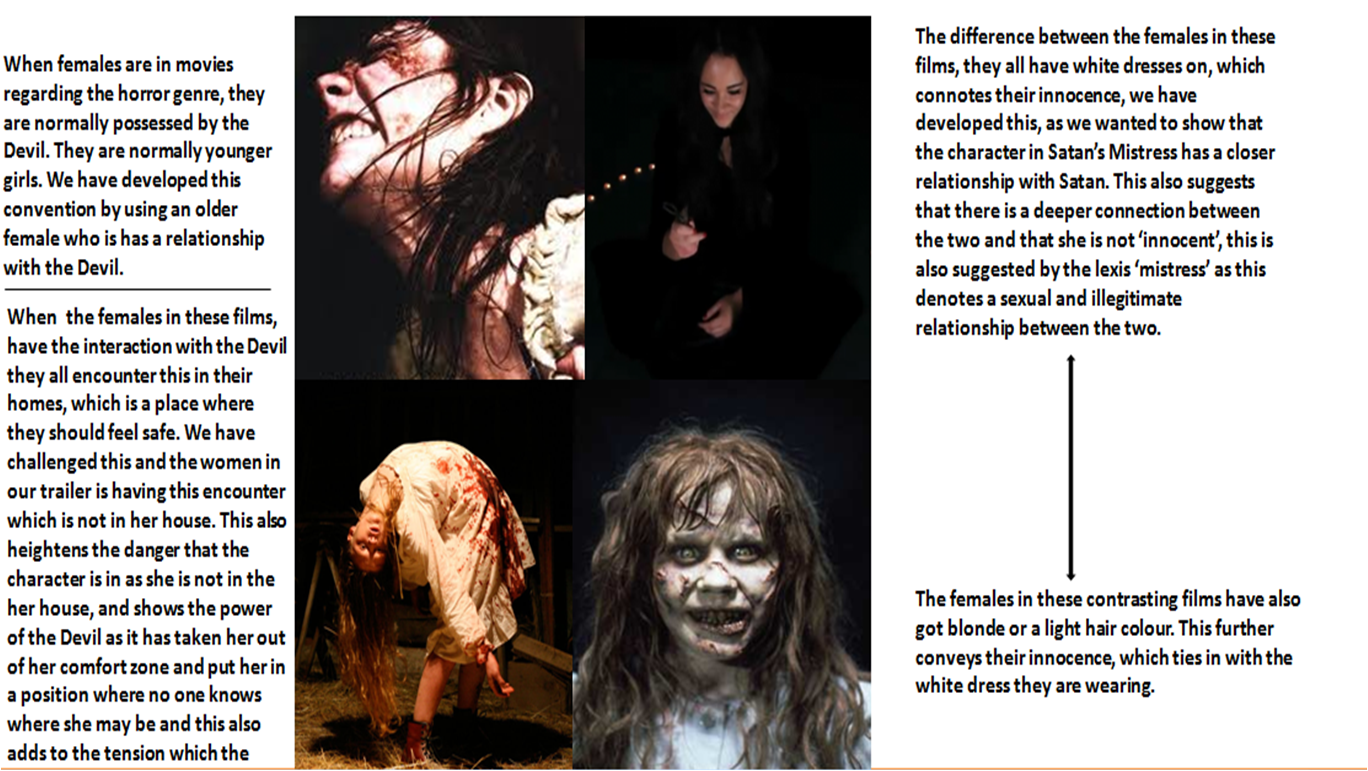
The victims in the horror genre are normally perceived as vulnerable due to the lack of clothes they are wearing. This heightens the danger than the victim is in, as they seen more defenceless. Normally if a female was the victim is normally wearing little clothing for example a low cut top or a short skirt or dress. When teenagers are in horror movies, they have normally been indulging in sexual activities, this happens in thriller horror ‘House of Wax’ where the teenagers who have actually had sex in the film end up being killed, this also happens in Hostel. In the scene where the boy is being tortured he is wearing a pair of jeans and this is the same in Satan’s Mistress, where the male is wearing just a pair of jeans. In regards to a male victim in Satan’s Mistress, the audience are unaware why the male is being tortured, and whether he is following the conventions of being sexually active, alike in other films.


Gender roles have always been crucial in the horror genre. In the old days, women did little more than try to wriggle out of their bonds as a train barreled down on them, or scream as a psycho slashed them in the shower. By the 1970s, with the rise of the feminism, female protagonists were fighting back, and something called the "final girl" archetype emerged--she was last one standing, the girl who escaped the killer.

When women are the killers in a horror film, they are not really suspected as the killers, and they don’t have the conventional costume that a male killer would wear, so that you know that they are the killer. Instead the idea from the Bible is being used, were Eve deceived Adam and that women are the ‘gateway’ to all evil, so the women villains seem normal and their killing is usually done secretly kill the people; such as the female killer in Scream 2. Since then, it's been a bit of a backward slide, and there have been no major developments so far as the role of women is concerned in horror films.
There is also a female in ‘Drag me to Hell’ who puts a curse on the women in danger, this is something we did not want to follow, by making the female actress look old and creepy, and therefore there must be something suspicious about her. The majority of the time when females are killers, they are children or young females. Films such as ‘Orphan’ and ‘The Ring’ have female killers in them, and they are both children. This creates an affect on the audience as children are seen as innocent and pure, and using them as killers is a scarier concept, however we have decided to challenge this convention. http://www.examiner.com/movie-in-newark/top-10-horror-movies-with-killer-kids
The conventional female in a horror film, is always, very pretty, ambitious and young. We wanted to challenge this convention and use these qualities and reverse them so they are upheld by the killer instead. we have done this so the audience question why the female lead has turned to killing people, it almost links in with the films, ‘Freddy Kruger’ as he was burned by a group of parents, and his killings are in revenge of his murder, so the audience think about what has happened to the female for her to turn to the Devil.
One comparison that can be made between some females in horror movies and in the leading female in ‘Satan’s Mistress’ is that they will have had a relationship with a spirit or most commonly the Devil.
Evaluation of poster
Evaluation of poster
In what ways does your media production use, develop or challenge forms and conventions of real media products?

 Both of our media products follow the forms and conventions of a stereotypical horror poster. The poster we have created for Satan’s Mistress by Dark Room Productions was inspired by the Saw 5 film poster. DRP wanted the audience to be able to see our film posters and notice the resemblance to professional posters in the market today such as The Eye starring Jessica Alba.
Forms and conventions are the guidelines media production companies follow so that their posters look like film posters and not a amateur piece of work. Conventions also inform the audience what is going on in the poster. By using conventions it also differentiates what genre the film is. For example a common convention for a romantic comedy film is a image of a man and woman, majority of the time the proxemics is very small and they are either embracing each other or looking into each other’s eyes lovingly.

 As you can see both romantic poster have high key lighting. The advantage of the bright light gives the allusion of serenity and peacefulness.
The conventions of a horror poster are low key lighting, image of the protagonist character or killer/stalker. The advantage of using a low key lighting image is because it gives a eerie and chilling feel to the audience. It becomes unsettling for the audience; they want to know why this person or thing is doing all the violence or bloodshed etc.

Majority of the time the character has his/her face covered; this is to shelf their identity from the audience. If the company reveals the face of the villain then it takes away the mystery that is key to any horror film. The poster is supposed to be a hint of information of what the film is about, that is why costume wise they have the characters face covered. Another advantage of covering the characters face is that when the audience looks at the poster they want tot know who the person is behind the mask. This will encourage them to go and watch the film.


In both of our posters we followed the conventions of horror which is having an image of the villain as the only picture on the poster. In one of the two posters we have, we have the female villain. Even though we followed the norm of having a picture of the villain we made our villain is a female. This goes against the conventions of a horror poster. Predominately in horror posters today the villains are always males. This can be seen in posters such as Halloween, Friday 13th part 2 and Nightmare on Elm Street. As you can see the villains are all male. We wanted to challenge the convention of this because we wanted to do something original. We discussed and found out that if we made our villain be male then it will just belike any old horror film. When the audience walk past our film poster they wouldn’t be too surprised at the fact that the villain is a male but the fact that we have a female villain it surprises the audience and they are shocked that for once the victims are males instead of the stereotypical beautiful young girls who get caught and tortured eg Pamela Anderson in Scary movie. In the film Anderson runs down the street in her underwear being chased by a man with an axe. This is in comparison to our film where the young male victims get tied up and tortured by a sadistic female.

In our poster we have very limited text on our poster. This was because we were imitating the Saw 5 poster. In this poster all it has is the title of the film, name of company and the date of the release` Halloween’. We thought this was very effective because Dark Room Productions believe in less is more. On posters we believe that the first thing the audience look at is the image, if they like what they see they then continue to read the poster to find the name of the film and when it is released. Audiences do not tend to read the bottom credits on a poster mostly because it is too small to read. On both of our posters we just put the title of our film and the name of our company, and finally at the bottom the text `coming soon’. We didn’t want to put a date because it leaves the audience in anticipation. They ware interested in the film and they would be anxious to know when it is released but by keeping the release date confidential it jus increase the excitement for the audience. And with this anticipation it will drive them to go and watch the film.
We looked at the Saw franchise when creating our posters. Here you can see how all of the posters have the same colour pattern, text and lighting.
Evaluation of Magazine

No comments:
Post a Comment